This is a 3-part series where I share my thinking on how to choose the right button for a sewing project. Choosing the button is part of the design process and therefore, like any creative endeavour, is highly subjective. What I am presenting here is based on my personal experience and preference. It aims to inspire and provide some strategies if you don’t know where to start. =)
Broadly speaking, there are 3 things I consider when I’m choosing the button for my sewing project:
1. Colour
2. Overall design
3. Size and application
In this post, I’ll cover the first factor - Colour.

Colour is probably the most important factor. The colour and print of your fabric will play a decisive role in determining what colour of a button you want to pair it with. For me, I think there are 3 ways to go about it:
1. Match it!

Black on black with the Minimalist Button, and pink on pink with the Sakura Button.
This is the more straightforward approach - pairing your fabric with buttons of matching colour. Often, I use this strategy when I’m working with a print. I would pick one colour in the print and match it with the button.

In the example above, I have a number of rich colours on my Vlisco fabric. I can choose buttons that match any of the colours on it. In the end, I went with the Pancake Button because the timber picks up the orange in the print. Plus bonus matching point: The warmth of the timber also mirrors the overall warm tone of the fabric.
This strategy works the other way around too, when it comes to button that has multiple colours:

This jacket is made of a vibrant blue wool fabric. I paired it with the Kaleidoscope Button as it features sparkly blue specks on it, among other colours. The general blue-purple tone of the button also matches well with the fabric colour.
As you can see, the colours need not match exactly. As long as they belong to the same ‘family’, they usually work well together.
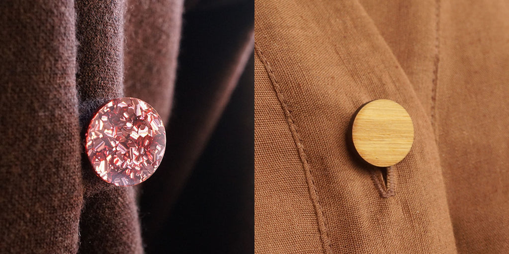
In colour theory terms, this is called monochromatic palettes. These palettes consist of different versions or intensities of the same colour. For example, pastel pink, rose pink, bright red, and maroon red are part of the red monochromatic palette.


In the examples above, I have matched a cholocate-brown fabric (which has a red undertone) with the Rose Gold Glitter Button, and the Pancake Button with a mustard-brown linen fabric.
2. Contrast it!
Also known as complementary colours in colour theory terms. Here we are picking colours that bring out the best of each other. (You know, like being in a healthy relationship)
Let’s start with my favourite kind of button as an example - the wooden button:

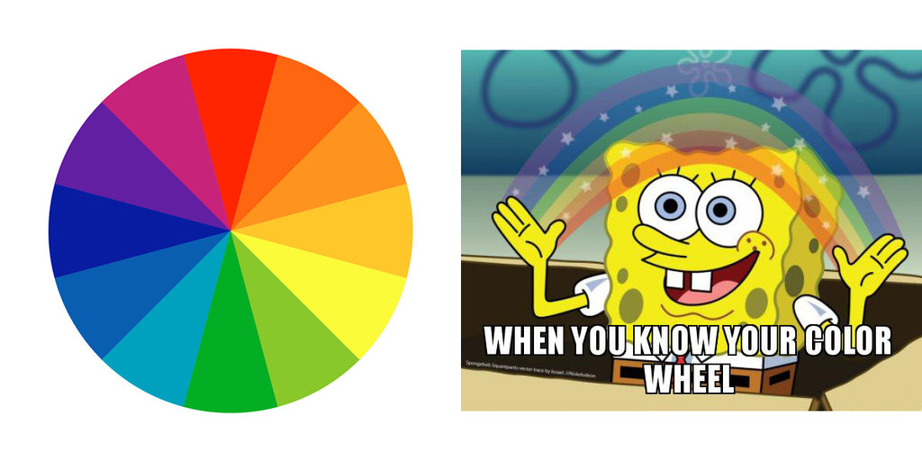
It works especially well with navy blue. Heck, it is probably my love for a navy blue shirt dress that started me on this journey of making wooden buttons. Anyway, looking at the colour wheel, I realised there is a theoretical underpinning to this preference. Orange and blue sit opposite to each other and they are considered a complementary pair. They complete and intensify each other.

But they don’t have to be directly opposed on the colour wheel to look good together. I find that wooden buttons work well with green, purple and all kinds of blue. For example, this green dress with the Tulip Button is one of my favourites:

Other complementary pairings:

Purple/Yellow - This is a classic colour pairing. Think royalty. A more modern interpretation would be pastel yellow and lilac. The example above features the Butterfly Button in Lemon Yellow and the Gingham Linen in Dusky Orchid from the Fabric Store.
Red/Green - Another classic pairing. Although full red and green may come across a bit Christmas-y, you can always tone down the intensities of both colours. The example above features the Tulip Button in Soft Pink and the Tencel Twill in Catnip from Fabric Deluxe.
3. Go Neutral
If matchy-matchy or contrasting colours are not your thing, you can also always choose a button in a neutral colour. Often thought of as the 'safe' option, this is also what produces timeless designs.
Black and white need no further introduction:

Our Black/White collection includes the Flower Button, the Cat Button, the Minimalist Button, the Hex Button and the Sashiko Button.
But have you thought about this translucent 'Icy' colour and the silver mirror finish?

As you can see, the Flower Button in Arctic Ice blends in well with any colour by letting the colour of the fabric through. The Shirt Button in Silver Mirror, on the other hand, can shine through a colourful print due to its reflectivity.
Conversely, if you are working with a neutral-coloured fabric, pairing it with wooden buttons can add a touch of warmth to your garment:

Featured above are the Ninja Star Button, the Clover Button and the big Sakura Button.
Final note
Hopefully this has helped you in narrowing down the colour(s) of button you want to use in your project. In our shop page, you can open the filter to select the colour(s) you are interested in to narrow down the search:

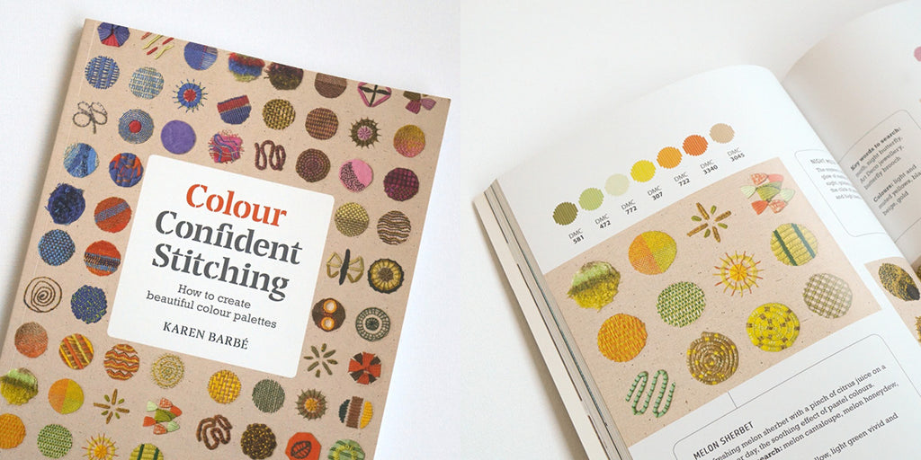
Colour is a big topic and the 3 strategies above only scratch the surface. If you want to learn more about colour theory in the context of crafting, I would recommend Colour Confident Stitching by Karen Barbé. It covers the basic of Colour Theory, how to extract colour palettes from paintings and photos, and provides beautiful inspiration for different colour stories.

This is it for the first edition of this 3-part series. How do you decide which button to use? Do you have a go-to colour pairing? I would love to hear from you in the comments below =)
